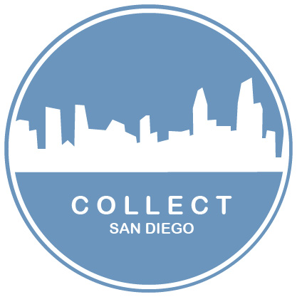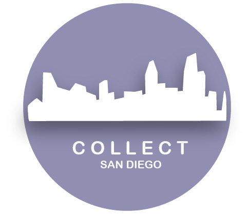
I’ve was very inspired by the clean designs in our readings when I began my original draft. I went through some great brainstorming and watercoloring sketching time. Eventually, I decided on a circle for Collect because I believe that circles are evocative of a group coming together. I knew I also wanted an element that was uniquely San Diego so I used the skyline. I originally wanted to go with the blueish color that you see in my photoshop design, but fell in love with the purple you see in my initial draft.

I began my initial draft with a simple circle and added a white stroke to it. I then layered this over a larger purple circle of the same hue. This formed the base layer of my logo. For the next part, I opened the photo from my Photoshop design of the San Diego skyline and traced it with the pen tool and then filled it in with an off-white color and created a new image. After I saved the simple white skyline, I input it into the circle. I then used the eraser tool to crop it because it was a bit long. The final thing I added to the design was the name.

Coming back to this design after feedback I still really liked it, but wanted to incorporate some of the changes suggested. The first thing I attempted was adding depth by placing a drop shadow behind the city and removing one of the outer rings. I ultimately decided I didn’t like the look of it for the style of Collect. I recognize that may be a personal preference though because a few of my friends like the below better.

Once I decided against the above design, I started again with my initial draft and the feedback I received. I went in and added the text” San Diego” so that people would know it was local to this area. I thought that was an excellent suggestion. I think it also provides a great format, if I want to expand Collect to other cities. I centered the text as well. The off-centered text was pointed out to me by a few people and I’m not really sure what I was going for with it off-center in the initial draft.
Finally, I then changed all of the lighter shades to the same white so I could more cleanly merge the skyline into the outer white circle. Then I decided to change the purple color to the original blue shade of the Photoshop design so there would be more unity amongst the products and more branding. I did this using the hex code. Overall, I love the simplicity of the design and could see it on a variety of products, invites, and other merchandise. Hope you like it! 🙂

2 Replies to “Final Illustrator Logo”