Draft Video Story

Picnic invite!

This week’s draft is truly a rough draft! I started out last weekend gathering footage, but a few weeks prior to that I settled on the idea of hosting a picnic as a kind of promotional video for Collect since it’s all about gathering creatively in your area. I thought for a bit about doing a how-to video, but felt like I’d already covered that with the audio story and so wanted to focus on visually telling the story of a picnic as a commercial for Collect.

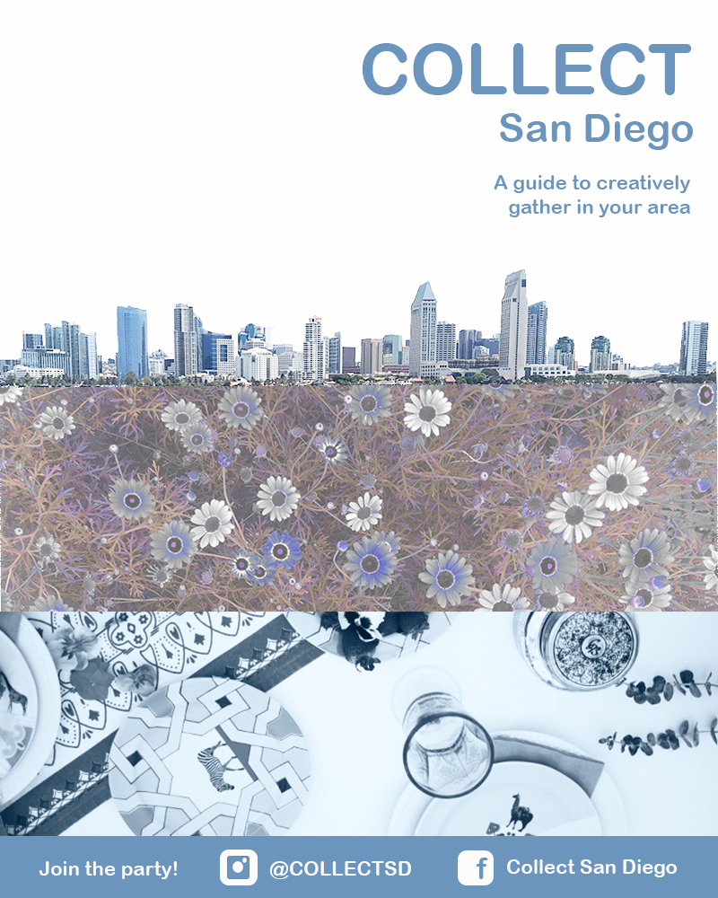
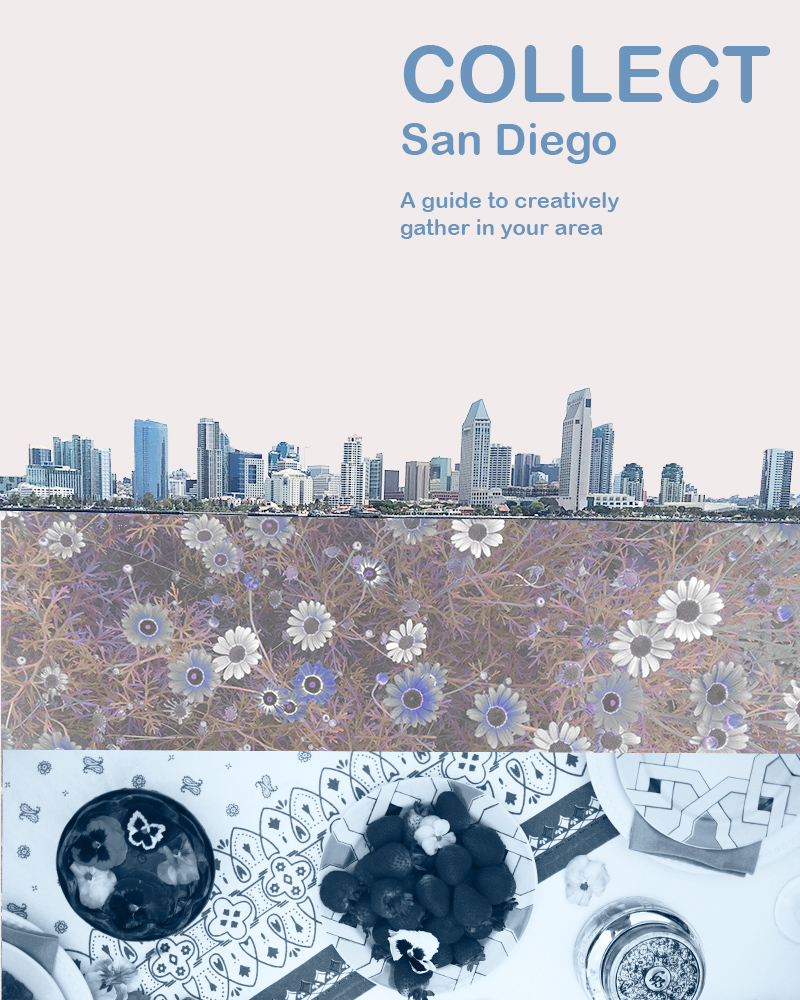
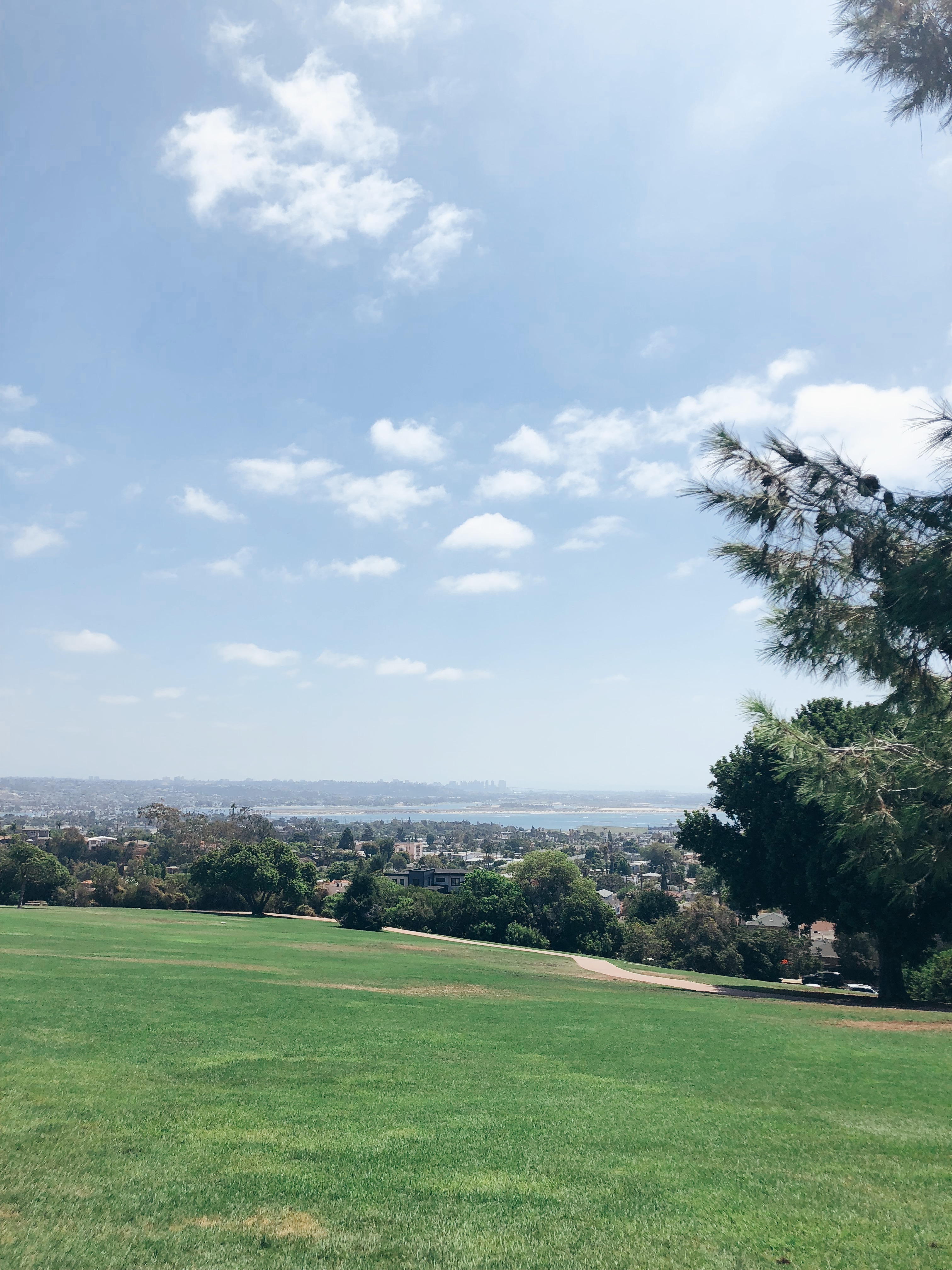
I knew exactly the park I wanted to host it at. It’s this great park called Kate O. Sessions that looks out over all of San Diego and has a great view of the city skyline. I figured this was fitting because of the logo that I designed for the Illustrator portion of this class. Once I settled on location I reached out to Reed and Rye (who I interviewed for my audio story) to see if she wanted to design the picnic. She was in! Next, I reached out to a friend currently in school for Peace and Justice to see if she wanted to give a sort of TED Talk to give our event some extra substance.

Kate O. Sessions Park

Once we nailed down the logistics, we arrived early last Sunday to set up. I neglected to create a shot list prior to and tremendously regret it because once we got set up and people started arriving it was hard to stay focused. Turns out it’s really hard to film an event you are in fact attending.

Yes, I made those waffles, but the rest was styled by Reed&Rye.

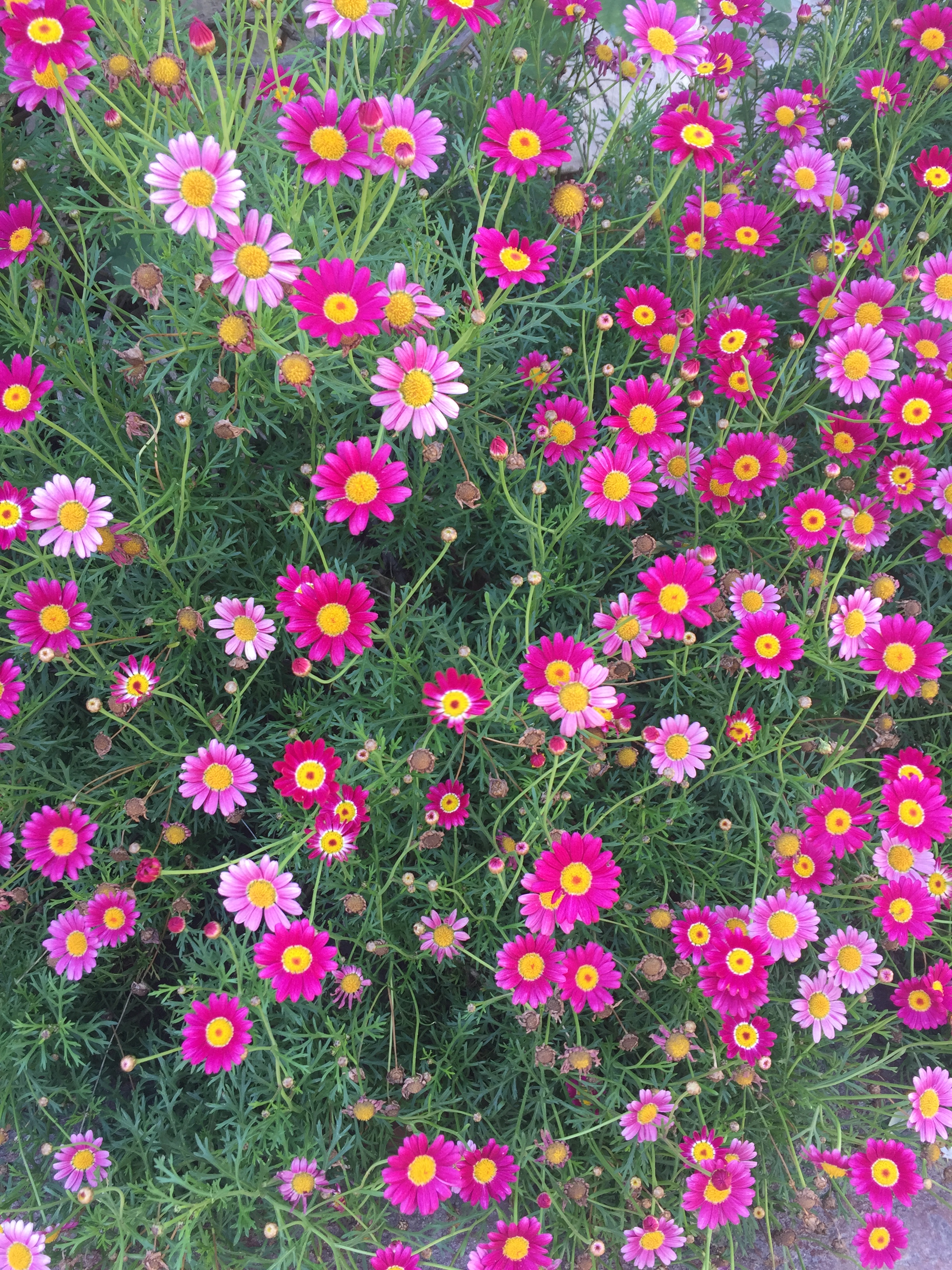
For filming, I used a mixture of my cellphone and my Canon DSLR. I knew I wanted lots of close ups of the food spread and tons of footage of my friends. The shots were harder to get than I planned for. I am very shaking filming even when I try to keep the camera and my elbows close. A lot of the footage I gathered was too shaky or quick to use. I needed to remind myself to slow down and stop filming vertically!!

I was able to get some usable footage that you will see in the video below, but please note that I will need to return to the park for the establishing shots and more shots of the parks amazing views. I have attached a Shot List reflecting this that you can reference. I have not inserted transitions or titles yet because I want to see how the park footage I gather tomorrow turns out. I should be able to take my time and move slowly. 

To begin the actual editing process I loaded up all my clips into Premiere and made smaller clips to fit into my sequence. I then had a MILD PANIC ATTACK when I thought I deleted them all. Turns out Premiere doesn’t like it when you delete clips from your computer. The clips I currently have sequenced are sequenced as best I could without the other park shots (see shot list). I still need to add transitions, and the title and end credits. I think it would be a really cool thing to have the Collect logo fade out and have the city skyline underneath right at the beginning. I am going to play around with that. The music I have attached now will be the final music and I found it on SoundCloud. It is called Positive Ukulele by Sokolovsky Music. I chose this music because of its positive relaxed vibe just like our picnic. I anticipate the final video to be around a minute long.

TimeVisualsAudio
0:00-
4.00
Establishing shot of park with San Diego skyline in the back ground fades in. Titles and Collect logo appear in white textMusic
fades
in
4.00-
6.00
Panning shot to location of picnicMusic
6.00-
13.00
Detail shot of picnic set up (hand moving items to prep).Music
13.00-20.00Group panning shot (circle formation)Music
20.00-25.00Close up on all elements of picnicMusic
25.00-30.00Group shot from behindMusic
30.00-33.00Picnic shot of greensMusic
33.00-39.00Picnic detail shotMusic
39.00-43.00People shot from zoomed out above angleMusic
43.00-47.00Picnic detail shotMusic 
47.00-51.00Close up of guest smiling/direct eye contact with cameraMusic
51.00-54.00Panning shot back to original viewMusic
54.00-60.00Back to San Diego city skyline and end creditsMusic fades
out
You will want to read my post before watching the film. The writeup fills in portions not yet filmed.

Final Audio Story

Hi there! This unit is about using Audition to create audio stories. I decided to do an interview that focused on event hosting for my audio story. I did this because Collect is all about inspiring people to gather creatively in their area. Not only do I want to host events, but I want to give people resources to plan their own! 

I chose an interview format because of the conversational nature of it and because I like things that are relatively straight forward when providing information. I also really appreciate list Podcasts where you are going through a list of key points or lessons. I ruled out something in the list format so I could get others involved.

I started off by drafting a couple questions centered around the idea of what makes a great event. I then asked two of my friends to meet downtown at You and Yours distillery to talk all things event planning. My friend Erica has been in the hospitality industry for over 10 years and my friend Ashley just started a design inspiration Instagram called Reed and Rye. Check out her stuff for some crazy decor inspo!

When we arrived at the venue it was relatively quiet, but that quickly changed and so we actually wound up recording the interview in my car just outside. I used one of the pro tips from the readings and recorded about a minute of ambient noise for the background before we headed out. The rest of the audio I recorded in my living room. Check out the below for the walk though of my technical process.

  • I used my iPhone for all recordings
  • I interviewed Ashley and Erica separately in my car and was then able to upload their tracks individually and then edit out me asking the questions.
  • I then recorded a sound bite all together with both of them thanking them to get a natural organic ending to the recording sesh.
  • I created a muti-track session in Audition and uploaded all these pieces included the rerecorded bits of me in my living room asking questions.
  • The ambient noise fades in after my introduction to the interview and fades out at the end of the session.
  • I begin the audio clip with an intro I recorded at a later date in my living room.
  • Once all 5 tracks (Ashley, Erica, Me, Conclusion, Ambient noise) were uploaded I began to hack away. The goal was to act as if they were both answering the same questions at the same time. Each of their individual interviews was about 3 minutes in length so I razored a lot out.
  • I added the intro at the beginning, edited the middle portion of them answering my spliced in questions, and then added in the reordered conclusion portion we recorded all together. All of this was layered over the ambient noise.

After received some substantial feedback last week I decided to make the below edits to my story:

  • The first thing I did was remove the question related to San Diego Parks. I received multiple feedback suggestions that it seemed out of place with the rest of the story. I agree for this specific topic/podcast because I imagine it being listened to by people not in San Diego
  • Secondly, I was asked by a few folks to add music. It was hard to find a free one that I was very keen on, but I finally selected a track from https://freemusicarchive.org . It is a track called Bless Life by Ketsa. I added this music for the intro and conclusion and included a fade in and out.
  • Since I added the music and because multiple people suggested the ambient noise was distracting, I removed that track.
  • Next I re-recorded the intro to give more of a back story to the interview. This included setting it up more up as a podcast and communicating more of how it was related to Collect. I also added a sort of sign off to make the ending more formal.
  • To clean up the overall sound I used the de-noise and de-hum features. They didn’t work well on every clip, so I see the importance of getting good audio from the get go, much like getting a good photo from the get go for Photoshop.
  • Finally, I played extensively with the volume levels for each clip hoping to get them as close as I could to uniform.

I really hope you enjoy the interview with the new additions! 🙂

Draft Audio Story

Image provided by Reed & Rye

Hi there! This week’s blog post is about using Audition to create audio stories. I decided to do an interview that focused on event hosting for my audio story. I did this because Collect is all about inspiring people to gather creatively in their area. Not only do I want to host events, but I want to give people resources to plan their own!

I chose an interview format because of the conversational nature of it and because I like things that are relatively straight forward when providing information. I also really appreciate list Podcasts where you are going through a list of key points or lessons. I ruled out something in the list format so I could get others involved.

I started off by drafting a couple questions centered around the idea of what makes a great event. I then asked two of my friends to meet downtown at You and Yours distillery to talk all things event planning. My friend Erica has been in the hospitality industry for over 10 years and my friend Ashley just started a design inspiration Instagram called Reed and Rye. Check out her stuff for some crazy decor inspo!

You & Yours Distillery in downtown San Diego

When we arrived at the venue it was relatively quiet, but that quickly changed and so we actually wound up recording the interview in my car just outside. I used one of the pro tips from the readings and recorded about a minute of ambient noise for the background before we headed out. The rest of the audio I recorded in my living room. Check out the below for the walk though of my technical process.

  • I used my iPhone for all recordings
  • I interviewed Ashley and Erica separately in my car and was then able to upload their tracks individually and then edit out me asking the questions.
  • I then recorded a sound bite all together with both of them thanking them to get a natural organic ending to the recording sesh.
  • I created a muti-track session in Audition and uploaded all these pieces included the rerecorded bits of me in my living room asking questions.
  • The ambient noise fades in after my introduction to the interview and fades out at the end of the session.
  • I begin the audio clip with an intro I recorded at a later date in my living room.
  • Once all 5 tracks (Ashley, Erica, Me, Conclusion, Ambient noise) were uploaded I began to hack away. The goal was to act as if they were both answering the same questions at the same time. Each of their individual interviews was about 3 minutes in length so I razored a lot out.
  • I added the intro at the beginning, edited the middle portion of them answering my spliced in questions, and then added in the reordered conclusion portion we recorded all together. All of this was layered over the ambient noise.

I hit the 3 minute mark exactly and it was hard to edit it down to that. I would’ve liked to add a bit of music at the beginning and end and maybe a more formal ending instead of just the laughter and then fade. I might consider editing out the parks question to gain some extra time. Give it a listen and let me know what you think, Enjoy! 🙂

https://soundcloud.com/user-198866600/draft-audio-story-mixdown

Final Illustrator Logo

I’ve was very inspired by the clean designs in our readings when I began my original draft. I went through some great brainstorming and watercoloring sketching time. Eventually, I decided on a circle for Collect because I believe that circles are evocative of a group coming together. I knew I also wanted an element that was uniquely San Diego so I used the skyline. I originally wanted to go with the blueish color that you see in my photoshop design, but fell in love with the purple you see in my initial draft.

I wound up eventually using the blue featured in this design for my final logo.

I began my initial draft with a simple circle and added a white stroke to it. I then layered this over a larger purple circle of the same hue. This formed the base layer of my logo. For the next part, I opened the photo from my Photoshop design of the San Diego skyline and traced it with the pen tool and then filled it in with an off-white color and created a new image. After I saved the simple white skyline, I input it into the circle. I then used the eraser tool to crop it because it was a bit long. The final thing I added to the design was the name.

My initial draft logo

Coming back to this design after feedback I still really liked it, but wanted to incorporate some of the changes suggested. The first thing I attempted was adding depth by placing a drop shadow behind the city and removing one of the outer rings. I ultimately decided I didn’t like the look of it for the style of Collect. I recognize that may be a personal preference though because a few of my friends like the below better.

A draft version of the logo featuring a drop shadow for depth

Once I decided against the above design, I started again with my initial draft and the feedback I received. I went in and added the text” San Diego” so that people would know it was local to this area. I thought that was an excellent suggestion. I think it also provides a great format, if I want to expand Collect to other cities. I centered the text as well. The off-centered text was pointed out to me by a few people and I’m not really sure what I was going for with it off-center in the initial draft.

Finally, I then changed all of the lighter shades to the same white so I could more cleanly merge the skyline into the outer white circle. Then I decided to change the purple color to the original blue shade of the Photoshop design so there would be more unity amongst the products and more branding. I did this using the hex code. Overall, I love the simplicity of the design and could see it on a variety of products, invites, and other merchandise. Hope you like it! 🙂

Draft Logo Design

I began my research into this design by watching the assigned videos. It was super cool to watch Aaron Draplin and Jessica Hische. I had no idea that Jessica had developed the Tilda font that’s on The Moonrise Kingdom poster. I actually have the poster above my bed! I loved the cleanness of Aaron’s designs and his commitment to researching older logos. I actually started following him on Instagram because of the videos and have been super inspired.

The first step I took was one Aaron suggested. I began by sketching and using my water colors to go through a couple ideas. Originally, I was thinking of the word Collect in a mosaic fashion. I was thinking the mosaic could represent the collection of people and diversity of activities that are apart of Collect. I finally settled on a circle for the Collect logo. 

My crude sketches.

I decided on a circle for Collect because I believe that circles are evocative of a group coming together. I knew I also wanted an element that was uniquely San Diego. I originally wanted to go with the blueish color that you see in my photoshop design, but fell in love with the purple hue by mistake.

I really struggled with Illustrator more than Photoshop so I was apprehensive as I began my draft. I began with a simple circle and added a white stroke to it. I then layered this over a larger purple circle of the same hue. This formed the base layer of my logo.

For the next part, I opened the photo from my Photoshop design of the San Diego skyline and traced it with the pen tool and then filled it in with an off-white color and created a new image. It’s still not clear to me if this meets the requirements, but after I saved the simple white skyline, I input it into the circle. I then used the eraser tool to crop it because it was a bit long.

The final thing I added to the design was the name. I considered warping the text, but decided the juxtaposition of the straight text to the circle was something I wanted. I also made sure it was the same font as the previous design I created to maintain unity.

As I move into the feedback cycle, I am considering a few things. I would really like to add more depth and am up for suggestions there. I was also strongly considering a different font. I would love to hear more on the city scape and if you think it communicates enough of the concept. Can’t wait to hear from you! 

Final Graphic Design Project

Week two on the Photoshop bandwagon! I’m back at it to revise my initial draft. To recap, for the draft, I wanted to do something to advertise Collect. It was critical for me to showcase that Collect is a guide to hosting outdoor events in the San Diego area. If it were to be all fleshed out, it would be a local guide to the best parks, fun ways to share a meal, and ideas for hosting a great outdoor events. In the initial and final draft, the San Diego skyline establishes location, the flowers establish that it is outdoors focused, and the table setting implies the event hosting aspect. The design tells a micro story of what Collect is about.

If you remember, when I first started I pulled a lot of inspiration from the general aesthetic of Darling Magazine. Check it out here: https://www.instagram.com/darling/ Working with that, I started with a photo of San Diego bay and used the magic wand tool to edit out everything except for the skyline. I then adjusted the brightness/contrast. Next, I embedded a photo of some flowers that I had used a saturation/hue mask to edit earlier in Photoshop. Then I placed this photo in the lower quadrant of the design.

Next, I added a new fill layer and placed it under the San Diego skyline and under the flowers to fill in the area that was previously the sky. Finally, I added a photo from an event I planned and decorated for a few months back to the very bottom. I added overlay masks here to change it to black and white and to alter the brightness and contrast so that it was bluer and more in line with the rest of the color scheme. To finish the draft, I added text.

After I completed the draft, I received feedback from my professor and peers. I received several suggestions and then got a chance to review it myself. First, I’d like to share the feedback I did incorporate.

  • The first thing that stuck out to me as a flaw on the draft was that the skyline was crooked. I did some sleuthing and figured out how to use the ruler tool to adjust this. I also adjusted the background fill layer to a more true white and toned down the saturation of the green in the trees.
  • Next, I aligned the text to the right-hand side. This was something that was not even on my radar until after the feedback.
  • I then moved the entire design up so I could incorporate a blue rectangular marquee at the bottom to add contact info.
  • The contact info at the bottom is probably what I am the proudest of. I created the Instagram and Facebook logos from scratch using the rounded rectangle tool and the ellipse tool. I merged these layers. I have linked the tutorial below.
  • Next, I saved the picture of the table setting as a separate photo so that I could crop it to use the lighter clearer portion of the photo to help better show what it is a photo of.
  • I then added the “Join the party!” at the bottom to get the reader to take action.
  • Finally, I saved and grouped the layers to have a cleaner working product.

There were a few feedback items I didn’t incorporate that I received during feedback. Check them out below:

  • I kept the color scheme monochromatic to keep it less busy and enhance the visual unity.
  • I did not change the font. I would love to have a different font, but after literally clicking through every available option, I still believed this was the best fit.
  • Finally, I couldn’t come up with a solution to merge the skyline with the flowers better. I appreciate the clean lines and hopefully straightening the skyline helps make it look less chopped off.

Overall this was a fantastic project to do and I feel 100 percent inspired to create a million more products. It was great to incorporate the lessons learned on visual unity, storytelling and the Gestalt Theory into this. I am super proud of the design and cannot wait to hone my Photoshop skills further. I hope you enjoyed tagging along on the journey!

Draft Graphic Design Project

This week was my first-time using Photoshop, so it has been quite the journey. One of the reasons I was super excited about this class was to become familiar with Photoshop. I have attempted to use other more advanced editing programs before with little to no lasting success, but the tutorials I did earlier this week and posted about were very helpful to get started.

For this first Photoshop project, I wanted to do something to advertise Collect, although I think with some text changes this could also be a great flier for an event. To start with, I did some research and originally came up with a different design inspired by the opening credits of 101 Dalmatians. I loved the first idea, but I wound up tossing it out because although I thought it had more story elements, I believed it was too busy and wanted to go for a simpler cleaner design. I worried it would be overwhelming for the audience.

I really love the general aesthetic of Darling Magazine when it comes to advertising and blogging, so I decided to check out their Instagram for inspiration next. Check it out here: https://www.instagram.com/darling/ I finally settled on something that I think has minimalistic aspects, but isn’t as minimalistic as their general aesthetic. I like more color and in general just MORE. Plus, I needed to incorporate at least three photos and show a bit of what Collect is about at the same time. 

It was critical for me to showcase that Collect is San Diego based, involves the outdoors, and was about food/togetherness/event planning. The San Diego skyline establishes location, the flowers establish that it is outside focused, and the table setting I hope implies the other elements. Hopefully this tells a micro story of what Collect is about.

To start off the technical aspects of my design, I started with a photo of San Diego bay and used the magic wand tool to edit out everything except for the sky line. I then adjusted the brightness/contrast. Next, I embedded a photo of some flowers that I had used a saturation/hue mask to edit earlier in Photoshop. Then I placed this photo in the lower quadrant of the design. They used to look like this:

Next, I added a new fill layer and placed it under the San Diego skyline and under the flowers to fill in the area that was previously the sky. Finally, I added a photo from an event I planned and decorated for a few months back to the very bottom. I added overlay masks here to change it to black and white and to alter the brightness and contrast so that it was bluer and more in line with the rest of the color scheme. To finish, I added text.

 I was originally going to make this an event flier and it certainly could be modified into one later, but I wanted to stick with a clean design just simply advertising Collect. I could potentially add in more contact info later like; Instagram, WordPress, or Facebook. Hope you like my design, I welcome your feedback. 🙂