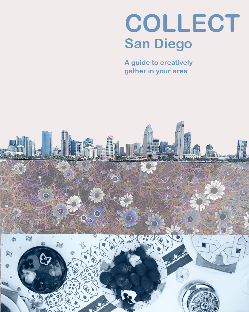
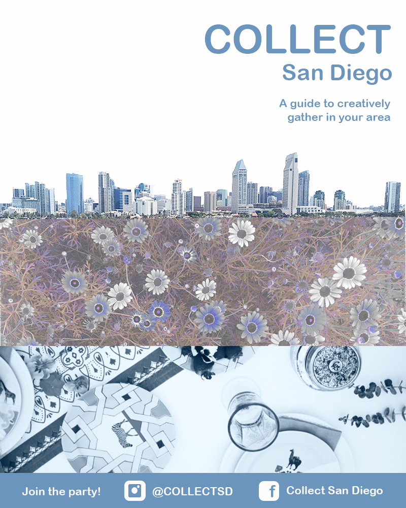
Week two on the Photoshop bandwagon! I’m back at it to revise my initial draft. To recap, for the draft, I wanted to do something to advertise Collect. It was critical for me to showcase that Collect is a guide to hosting outdoor events in the San Diego area. If it were to be all fleshed out, it would be a local guide to the best parks, fun ways to share a meal, and ideas for hosting a great outdoor events. In the initial and final draft, the San Diego skyline establishes location, the flowers establish that it is outdoors focused, and the table setting implies the event hosting aspect. The design tells a micro story of what Collect is about.
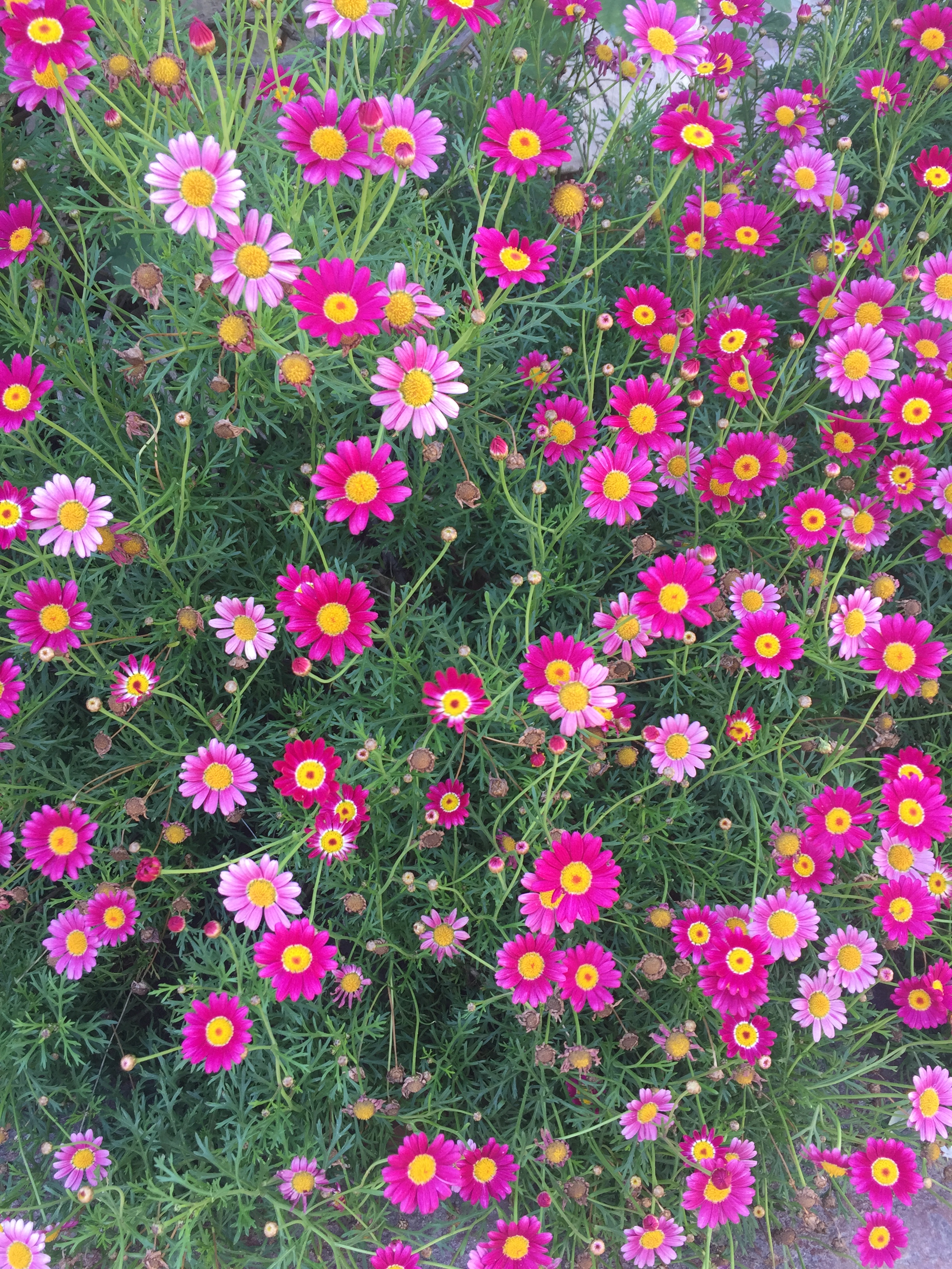
If you remember, when I first started I pulled a lot of inspiration from the general aesthetic of Darling Magazine. Check it out here: https://www.instagram.com/darling/ Working with that, I started with a photo of San Diego bay and used the magic wand tool to edit out everything except for the skyline. I then adjusted the brightness/contrast. Next, I embedded a photo of some flowers that I had used a saturation/hue mask to edit earlier in Photoshop. Then I placed this photo in the lower quadrant of the design.
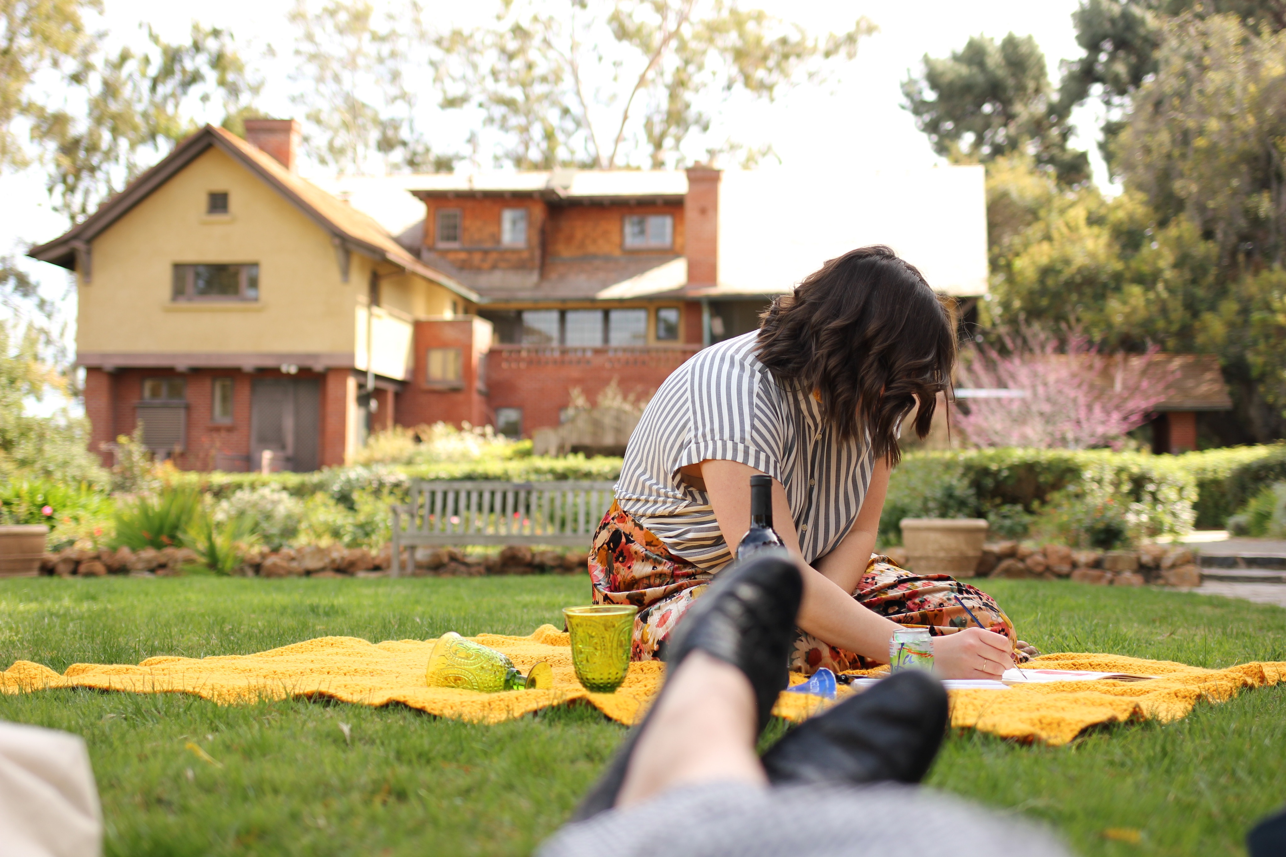
Next, I added a new fill layer and placed it under the San Diego skyline and under the flowers to fill in the area that was previously the sky. Finally, I added a photo from an event I planned and decorated for a few months back to the very bottom. I added overlay masks here to change it to black and white and to alter the brightness and contrast so that it was bluer and more in line with the rest of the color scheme. To finish the draft, I added text.
After I completed the draft, I received feedback from my professor and peers. I received several suggestions and then got a chance to review it myself. First, I’d like to share the feedback I did incorporate.
- The first thing that stuck out to me as a flaw on the draft was that the skyline was crooked. I did some sleuthing and figured out how to use the ruler tool to adjust this. I also adjusted the background fill layer to a more true white and toned down the saturation of the green in the trees.
- Next, I aligned the text to the right-hand side. This was something that was not even on my radar until after the feedback.
- I then moved the entire design up so I could incorporate a blue rectangular marquee at the bottom to add contact info.
- The contact info at the bottom is probably what I am the proudest of. I created the Instagram and Facebook logos from scratch using the rounded rectangle tool and the ellipse tool. I merged these layers. I have linked the tutorial below.
- Next, I saved the picture of the table setting as a separate photo so that I could crop it to use the lighter clearer portion of the photo to help better show what it is a photo of.
- I then added the “Join the party!” at the bottom to get the reader to take action.
- Finally, I saved and grouped the layers to have a cleaner working product.
There were a few feedback items I didn’t incorporate that I received during feedback. Check them out below:
- I kept the color scheme monochromatic to keep it less busy and enhance the visual unity.
- I did not change the font. I would love to have a different font, but after literally clicking through every available option, I still believed this was the best fit.
- Finally, I couldn’t come up with a solution to merge the skyline with the flowers better. I appreciate the clean lines and hopefully straightening the skyline helps make it look less chopped off.
Overall this was a fantastic project to do and I feel 100 percent inspired to create a million more products. It was great to incorporate the lessons learned on visual unity, storytelling and the Gestalt Theory into this. I am super proud of the design and cannot wait to hone my Photoshop skills further. I hope you enjoyed tagging along on the journey!