Changing My Mind on the Death Penalty

I didn’t always believe eradicating the death penalty was something essential to the flourishing of human society, but what I have shared below helped change my mind.

I’ve seen A LOT of crime television in my day. I remember watching episodes till the end and what I thought was righteous anger would well up in me as some of these perpetrators were given the death penalty. I would think to myself, “Good. Justice was served, they got what they deserved.” What eventually altered my mind about the death penalty a few years later was a journey through numerous books, one month on jury duty, and being clearly presented with facts about the effects of the death penalty on the victims’ families, correctional staff and society. I’d like to share with you some of things I’ve found helpful in examining the death penalty in the hopes that you will see the death penalty as a practice that harms everyone it touches.

1. Shane Claiborne’s Book Executing Grace
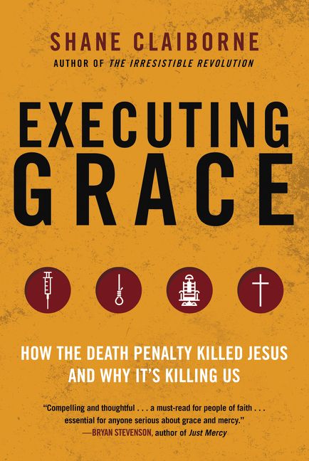
When it comes to the death penalty, I expected this book to talk about cost and death count, I even assumed it would talk about the wrongfully convicted, but I was very surprised to hear about the peripheral victims. The victims we don’t often think of are the family members and the correctional staff. When it comes to family members, this book does a great job or showing that “Many of those who have healed best have not sought the death penalty, but found closure in forgiveness and restorative justice, or even in life in prison for the killer.” Secondly it addresses the psychological toll on the correctional staff and executioners. The book shares a story from a prison warden who oversaw 5 executions and speaks about the toll on his employees and his own mental health. He remarked that, “killing someone, even a murderer, also kills some of the good in you.”

2. The Innocence Project

More often than we want to recognize, some innocent defendants have been convicted and sentenced to death. – Supreme Court justice Sandra Day O’Connor.

The fact that there are innocent men incarcerated for crimes they have not committed should cause us to reconsider the death penalty for any man. The Innocence Project works to exonerate the wrongly convicted and made me aware that wrongful convictions do happen and often times are racially biased. “For every nine executions there has been one exoneration. And for every hundred people condemned to die, four are likely innocent.”  Those stats are some of the most convincing for me against the death penalty. Better every man convicted serve life, then one more innocent man be killed.

3. Jury Duty and the Role of Individual Experience

About a year and a half ago I spent a month on jury duty for a murder trial. That month exposed me to some dark scenarios that happen on a regular basis in the underbelly of my city. The perpetrator grew up in a drug filled home and was afforded few of the privileges others have been. It caused me to evaluate the way in which the circumstances we are born in affect us. It caused me to question if we as humans have the right to take another life and to determine what justice is. We are very quick to assume our innocence in the same situation, when we have never walked that path. I think any person who would blindly say they have the right to take a life for a life is missing the point of what true justice, true innocence, and true restoration could be. That’s why I am sharing these things with you. I want Americans to be able to enter into these conversations thoughtfully and emerge with an improved system that is equal parts mercy and justice. For us to do that, we need to evaluate the information in front of us humbly and decide what kind of nation and people we want to be.

There is so much more to learn about the true cost of the death penalty. For more information please check out these resources:

The Innocence Project

Executing Grace

Death Penalty Information Center

Just Mercy

All quotes in this article were taken from Shane Claiborne’s book Executing Grace.

Reed & Rye Floral Design

Ashley Renee, the creative visionary behind Reed & Rye talks inspiration, creating a wedding with forever in mind, and her favorite bloom.

bride with floral bouquet
Ashley Renee of Reed & Rye Photo by Andre Argaez

Fresh beginnings from fresh blooms…

Ashley Renee launched her company in the Summer of 2019. Her Californian roots go deep. She was raised in Visalia and moved to San Diego in 2017 for a Dental Hygienist position. She met her husband after moving to San Diego from Visalia. During the planning of her 2019 wedding she realized she could channel her natural creativity into a career providing florals and event styling, all while tapping into her Californian roots. Reed & Rye’s Instagram feed exudes Californian beauty and boho vibes. It showcases the diversity of her creativity as a floral artist.

Reed & Rye’s Instagram Feed

Ashley has always been a creative at heart, as a kid she made jewelry and was president of the art club in high school and even took drawing classes in college. Art has always been a huge part or her life and frequently colors the ways she sees things. When her natural creativity was introduced to wedding planning she gravitated towards the floral and event design aspects of it the most strongly. It was the “shapes, colors, and textures” that drew her to floral design.

Ashley has a keen artistic eye and a distinct style. She’s most inspired by “warm tones, the variety of complex textures, and just the ability of a dried flower or foliage to live on past it’s typical life span for years to come!” It was this love of creating something that could last which led her in a slightly new direction.

Venturing into new flowering territory…

Wanting to reach more than just Southern California, Ashley recently “ventured into a new territory of flowering. The typical bride spends on average $250 for her wedding bouquet and then it sadly dies.”  Ashley opened up an Etsy store selling forever bouquets and arrangements for special occasions. These allow her clients to keep their wedding bouquets forever or gift a forever arrangement. These are made with a mixture of silk and dried florals and are equally stunning to the fresh florals she provides for events. She has “come up with options for brides to purchase bouquets that will last for years to come! Whether it be an all dried bouquet or a silk floral bouquet, they will stay in great shape and will serve as a wonderful memory of their beautiful day.” 

Forever bouquet by Reed & Rye . Photo by Hannah Pennell

Ashley’s favorite bloom…

When I asked Ashley what her favorite bloom was she said it was the Brown Lisianthus. I’d never seen this flower before, but fits with her warm boho vibes perfectly. For further inspiration, couples can check out Reed & Rye’s Instagram, Facebook, Pinterest, and Etsy.

Ashley Renee with Brown Lisianthus, her current favorite bloom.

About the Author

Hannah Pennell writes about all that is style and fashion. She enjoys using her writing to shed light on artists and creatives in the San Diego area. She’s a big believer in breakfast, talking philosophy, and all things fashion. Follow her on Instagram and Twitter.

Final Graphic Design Project

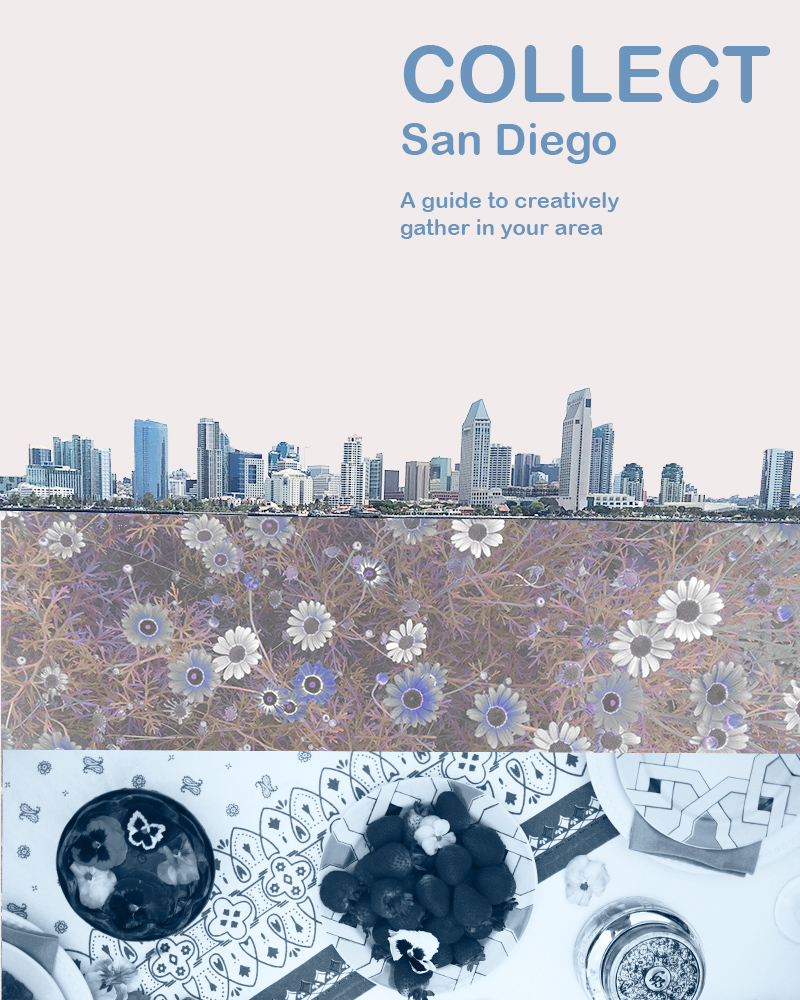
Week two on the Photoshop bandwagon! I’m back at it to revise my initial draft. To recap, for the draft, I wanted to do something to advertise Collect. It was critical for me to showcase that Collect is a guide to hosting outdoor events in the San Diego area. If it were to be all fleshed out, it would be a local guide to the best parks, fun ways to share a meal, and ideas for hosting a great outdoor events. In the initial and final draft, the San Diego skyline establishes location, the flowers establish that it is outdoors focused, and the table setting implies the event hosting aspect. The design tells a micro story of what Collect is about.

If you remember, when I first started I pulled a lot of inspiration from the general aesthetic of Darling Magazine. Check it out here: https://www.instagram.com/darling/ Working with that, I started with a photo of San Diego bay and used the magic wand tool to edit out everything except for the skyline. I then adjusted the brightness/contrast. Next, I embedded a photo of some flowers that I had used a saturation/hue mask to edit earlier in Photoshop. Then I placed this photo in the lower quadrant of the design.

Next, I added a new fill layer and placed it under the San Diego skyline and under the flowers to fill in the area that was previously the sky. Finally, I added a photo from an event I planned and decorated for a few months back to the very bottom. I added overlay masks here to change it to black and white and to alter the brightness and contrast so that it was bluer and more in line with the rest of the color scheme. To finish the draft, I added text.

After I completed the draft, I received feedback from my professor and peers. I received several suggestions and then got a chance to review it myself. First, I’d like to share the feedback I did incorporate.

  • The first thing that stuck out to me as a flaw on the draft was that the skyline was crooked. I did some sleuthing and figured out how to use the ruler tool to adjust this. I also adjusted the background fill layer to a more true white and toned down the saturation of the green in the trees.
  • Next, I aligned the text to the right-hand side. This was something that was not even on my radar until after the feedback.
  • I then moved the entire design up so I could incorporate a blue rectangular marquee at the bottom to add contact info.
  • The contact info at the bottom is probably what I am the proudest of. I created the Instagram and Facebook logos from scratch using the rounded rectangle tool and the ellipse tool. I merged these layers. I have linked the tutorial below.
  • Next, I saved the picture of the table setting as a separate photo so that I could crop it to use the lighter clearer portion of the photo to help better show what it is a photo of.
  • I then added the “Join the party!” at the bottom to get the reader to take action.
  • Finally, I saved and grouped the layers to have a cleaner working product.

There were a few feedback items I didn’t incorporate that I received during feedback. Check them out below:

  • I kept the color scheme monochromatic to keep it less busy and enhance the visual unity.
  • I did not change the font. I would love to have a different font, but after literally clicking through every available option, I still believed this was the best fit.
  • Finally, I couldn’t come up with a solution to merge the skyline with the flowers better. I appreciate the clean lines and hopefully straightening the skyline helps make it look less chopped off.

Overall this was a fantastic project to do and I feel 100 percent inspired to create a million more products. It was great to incorporate the lessons learned on visual unity, storytelling and the Gestalt Theory into this. I am super proud of the design and cannot wait to hone my Photoshop skills further. I hope you enjoyed tagging along on the journey!

Draft Graphic Design Project

This week was my first-time using Photoshop, so it has been quite the journey. One of the reasons I was super excited about this class was to become familiar with Photoshop. I have attempted to use other more advanced editing programs before with little to no lasting success, but the tutorials I did earlier this week and posted about were very helpful to get started.

For this first Photoshop project, I wanted to do something to advertise Collect, although I think with some text changes this could also be a great flier for an event. To start with, I did some research and originally came up with a different design inspired by the opening credits of 101 Dalmatians. I loved the first idea, but I wound up tossing it out because although I thought it had more story elements, I believed it was too busy and wanted to go for a simpler cleaner design. I worried it would be overwhelming for the audience.

I really love the general aesthetic of Darling Magazine when it comes to advertising and blogging, so I decided to check out their Instagram for inspiration next. Check it out here: https://www.instagram.com/darling/ I finally settled on something that I think has minimalistic aspects, but isn’t as minimalistic as their general aesthetic. I like more color and in general just MORE. Plus, I needed to incorporate at least three photos and show a bit of what Collect is about at the same time. 

It was critical for me to showcase that Collect is San Diego based, involves the outdoors, and was about food/togetherness/event planning. The San Diego skyline establishes location, the flowers establish that it is outside focused, and the table setting I hope implies the other elements. Hopefully this tells a micro story of what Collect is about.

To start off the technical aspects of my design, I started with a photo of San Diego bay and used the magic wand tool to edit out everything except for the sky line. I then adjusted the brightness/contrast. Next, I embedded a photo of some flowers that I had used a saturation/hue mask to edit earlier in Photoshop. Then I placed this photo in the lower quadrant of the design. They used to look like this:

Next, I added a new fill layer and placed it under the San Diego skyline and under the flowers to fill in the area that was previously the sky. Finally, I added a photo from an event I planned and decorated for a few months back to the very bottom. I added overlay masks here to change it to black and white and to alter the brightness and contrast so that it was bluer and more in line with the rest of the color scheme. To finish, I added text.

 I was originally going to make this an event flier and it certainly could be modified into one later, but I wanted to stick with a clean design just simply advertising Collect. I could potentially add in more contact info later like; Instagram, WordPress, or Facebook. Hope you like my design, I welcome your feedback. 🙂