
This week was my first-time using Photoshop, so it has been quite the journey. One of the reasons I was super excited about this class was to become familiar with Photoshop. I have attempted to use other more advanced editing programs before with little to no lasting success, but the tutorials I did earlier this week and posted about were very helpful to get started.
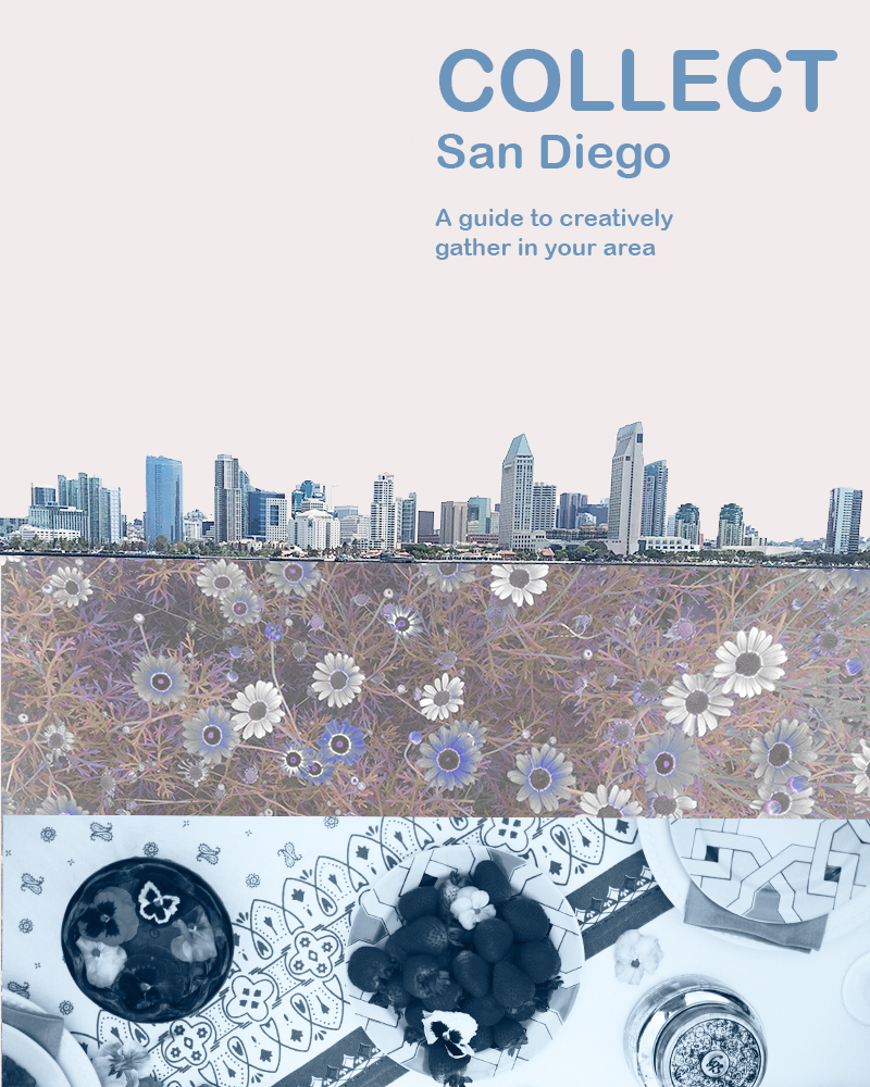
For this first Photoshop project, I wanted to do something to advertise Collect, although I think with some text changes this could also be a great flier for an event. To start with, I did some research and originally came up with a different design inspired by the opening credits of 101 Dalmatians. I loved the first idea, but I wound up tossing it out because although I thought it had more story elements, I believed it was too busy and wanted to go for a simpler cleaner design. I worried it would be overwhelming for the audience.
I really love the general aesthetic of Darling Magazine when it comes to advertising and blogging, so I decided to check out their Instagram for inspiration next. Check it out here: https://www.instagram.com/darling/ I finally settled on something that I think has minimalistic aspects, but isn’t as minimalistic as their general aesthetic. I like more color and in general just MORE. Plus, I needed to incorporate at least three photos and show a bit of what Collect is about at the same time.
It was critical for me to showcase that Collect is San Diego based, involves the outdoors, and was about food/togetherness/event planning. The San Diego skyline establishes location, the flowers establish that it is outside focused, and the table setting I hope implies the other elements. Hopefully this tells a micro story of what Collect is about.
To start off the technical aspects of my design, I started with a photo of San Diego bay and used the magic wand tool to edit out everything except for the sky line. I then adjusted the brightness/contrast. Next, I embedded a photo of some flowers that I had used a saturation/hue mask to edit earlier in Photoshop. Then I placed this photo in the lower quadrant of the design. They used to look like this:
Next, I added a new fill layer and placed it under the San Diego skyline and under the flowers to fill in the area that was previously the sky. Finally, I added a photo from an event I planned and decorated for a few months back to the very bottom. I added overlay masks here to change it to black and white and to alter the brightness and contrast so that it was bluer and more in line with the rest of the color scheme. To finish, I added text.
I was originally going to make this an event flier and it certainly could be modified into one later, but I wanted to stick with a clean design just simply advertising Collect. I could potentially add in more contact info later like; Instagram, WordPress, or Facebook. Hope you like my design, I welcome your feedback. 🙂

This is great, Hannah. It reminds me of the Photoshop tutorial we completed with the cougar. I really like the layering and I feel like you are telling a story with the table settings and the skyline. I’ve never followed/looked at Darling Media, but agree that their minimalist designs are visually appealing and can see that the same aesthetic has been applied here.
I did find that the text in the top right didn’t quite line up in a way that made sense to me visually. The two lines under the title may need to be moved slightly to the right, or be played around with to make it fit better with the rest of the image. Additionally, without the explanation of the photo you’ve put in on the bottom, I wasn’t entirely sure what I was looking at. It might be interesting to see that played out with a pop of color. That being said, however, the filtering you’ve done with the flowers and the sleek skyline incorporate a lot of the grey and clean lines that mirror Darling Media, it was aesthetically pleasing.
LikeLike
Misty,
Thanks so much for your feedback! Looking forward to working with you! 🙂
LikeLike
After having a few days to evaluate my design and receiving some great feedback from folks, there are a few things I would absolutely change about this design. I would align the text in the top right so that it flows better. I need to figure out how to straighten the skyline and see if there isn’t something I could do better to the bottom photo to make it clearer what it is. I want to try moving the entire design up so that I can add a small stripe on the bottom with contact info. I can’t move the city skyline up without moving the entire design up because I cropped the skyline, but I may try attempting to merge those better or tuck it more under the floral layer more, so it doesn’t appear cut off. If I were going to use it as an event flier it would be easy to add some info, but I envision this more as a cover for something or the front side of a flier. Looking forward to trying out the changes. Thanks to everybody for the feedback!
LikeLike
Hannah,
I love the color story in this creation. Your mastery of the photoshop filters is evident. The colors really work together well. I also love that the flowers are under the city, almost like roots. The city does look a bit crooked, as do the lines of text. I’m also not sold on the font, but I like that it is crisp and clean. I think this would be a great design to build off of and add any event-specific information at a later date. Overall I think this is a great start, and you nailed the aesthetic.
LikeLike