
I began my research into this design by watching the assigned videos. It was super cool to watch Aaron Draplin and Jessica Hische. I had no idea that Jessica had developed the Tilda font that’s on The Moonrise Kingdom poster. I actually have the poster above my bed! I loved the cleanness of Aaron’s designs and his commitment to researching older logos. I actually started following him on Instagram because of the videos and have been super inspired.

The first step I took was one Aaron suggested. I began by sketching and using my water colors to go through a couple ideas. Originally, I was thinking of the word Collect in a mosaic fashion. I was thinking the mosaic could represent the collection of people and diversity of activities that are apart of Collect. I finally settled on a circle for the Collect logo.
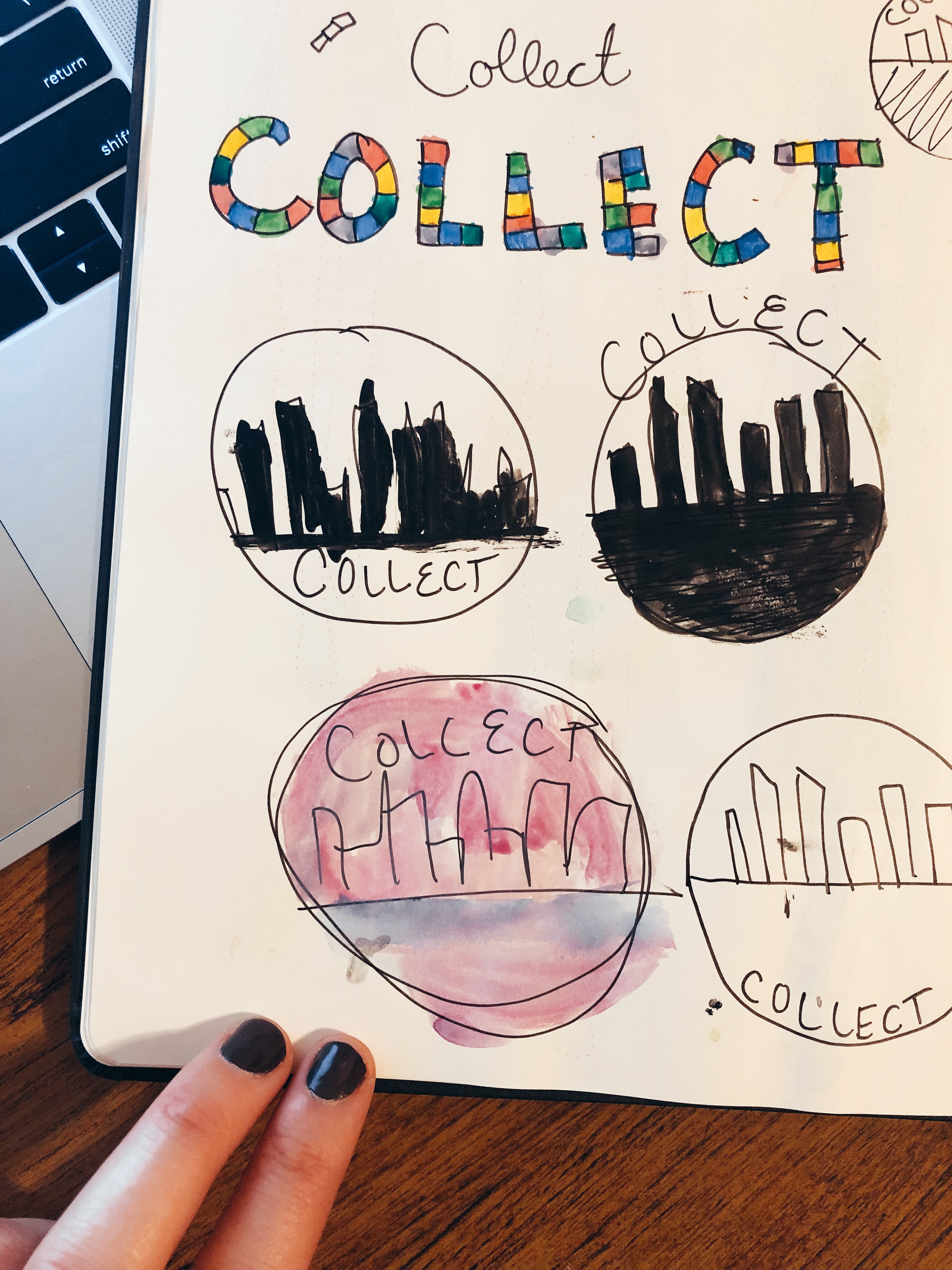
I decided on a circle for Collect because I believe that circles are evocative of a group coming together. I knew I also wanted an element that was uniquely San Diego. I originally wanted to go with the blueish color that you see in my photoshop design, but fell in love with the purple hue by mistake.
I really struggled with Illustrator more than Photoshop so I was apprehensive as I began my draft. I began with a simple circle and added a white stroke to it. I then layered this over a larger purple circle of the same hue. This formed the base layer of my logo.
For the next part, I opened the photo from my Photoshop design of the San Diego skyline and traced it with the pen tool and then filled it in with an off-white color and created a new image. It’s still not clear to me if this meets the requirements, but after I saved the simple white skyline, I input it into the circle. I then used the eraser tool to crop it because it was a bit long.
The final thing I added to the design was the name. I considered warping the text, but decided the juxtaposition of the straight text to the circle was something I wanted. I also made sure it was the same font as the previous design I created to maintain unity.
As I move into the feedback cycle, I am considering a few things. I would really like to add more depth and am up for suggestions there. I was also strongly considering a different font. I would love to hear more on the city scape and if you think it communicates enough of the concept. Can’t wait to hear from you!

Hannah, first and foremost, great work. I really liked reading through your design process and loved that you included the sketches. Like you, I had a much harder time with the Illustrator tutorials. It was reassuring to read that you struggled with Illustrator, but don’t worry, it doesn’t show in your design.
I like that you picked a circle. I agree about the feeling that a circle evokes, and that comes through in the design. My first suggestion is regarding the font. Maybe it’s just me, but it doesn’t look centered, and so I find my eyes lingering on it just a little too long. Also, I agree that maybe you could try some different fonts. I think your current font is nice because it has that circular feel, but maybe another style in juxtaposition would be more pleasing.
I also really like the city skyline and think you did a good job incorporating it.
My other suggestion would be to play with the outside border, or maybe add a gradient and some dimension. The logo is a little flat without any shading. Personally, I like it because it’s very minimal and clean, but I think it would be fun to play with some depth to see if it works with your design vision. Maybe the city could be reflecting downward? Or you could add a sun or cloud in the sky as well?
Overall, I think you did a really great job and have really enjoyed your design projects so far this semester. I can’t wait to see your final design!
LikeLike
Hi Hannah, your sketches and ideas were fun to see how your logo is progressing. Your circle design is simple and does portray a group-like setting. The cityscape backdrop is very cool and looks professional. I like the light blue color you chose it’s different and doesn’t give off a dull appearance that an ordinary blue or gray may have.
I’m from Southern California, too, and although I think your cityscape cutout is creative and interesting, I’d like to see a more monumental connection to San Diego. Alternatively, you can write in smaller text a reference to San Diego, like “originating from San Diego.”
Your text looks clean and easy to read and making it larger or bolder may have more effect and pull in your audience.
I really like the design you have come up with, and I think your skills with Illustrator are very good! Keep it up.
LikeLike
Thanks so much to everybody for the super helpful feedback. I’ve been evaluating my design over the past few days and overall I still really like it, but there are things that need to be refined. I loved what I heard in peer feedback about possibly adding some sort of text to make it more specifically San Diego. I will definitely play with that. I also need to clean up the edges of the city scape. I roughly erased them with the eraser tool. I also would really like to incorporate more depth like Kathryn mentioned. I am not totally sure how I will go about doing that yet. I like the text slightly off center as it is, but that may change if I play with the font or add more text. Once I clean up those items I may actually play with a shadow on the city or a cloud like Kathryn suggested as well. Super helpful feedback! Overall would really like to see what more depth would look like in my design. Excited to see everyone’s final logos.
LikeLike